

Beyond the Design: How to Choose the Right Paper for Your Screen Print Project
At Cracked Ego, we often say that a digital file is only a promise. The paper is the delivery.
When you’ve spent weeks refining a campaign’s visual identity or designing a limited-edition gig poster, the physical substrate becomes the final collaborator in your work. It determines how the ink sits, how the light hits the colors, and—most importantly—how the piece feels in your client’s hands.
Screen printing is an interplay of chemistry and physics. To ensure your project comes off the press looking exactly as you envisioned, you need a sheet that can handle the unique demands of the process.
Here is what our production team looks for when selecting paper, and how those factors influence your final result.
1. Ink Absorption and "Sizing"
Not all paper interacts with ink the same way. In screen printing, we deposit a significant amount of ink onto the sheet.
The Science: We look for "surface-sized" papers. Sizing is a treatment that reduces the paper's absorbency.
The Result: If a paper is too absorbent (unsized), the ink sinks into the fibers, resulting in duller colors and fuzzy edges. A surface-sized paper keeps the ink sitting proudly on top. This allows for vibrant, punchy colors and enables us to layer multiple colors without the paper becoming saturated and warping.
2. Dimensional Stability
Screen printing is a sequential process; we print one color at a time. If you have a four-color design, the paper passes through the press four times.
The Science: We require paper that resists stretching or contracting when exposed to the moisture of the ink or the heat of the drying process.
The Result: "Dimensional stability" ensures that the paper stays the exact same size from the first color to the last. This is non-negotiable for tight registration (alignment). If the paper shifts even a millimeter, the final image will look blurry or out of focus.
3. Texture vs. Detail
The finish of the paper is a major aesthetic choice, but it also dictates the level of detail we can hold.
Smoother Papers: If your design features fine lines, photographic halftones, or small typography, a smooth sheet is essential. It provides a flat canvas for sharp, crisp impressions.
Textured Papers: A heavy tooth or vellum finish adds a beautiful, organic tactile quality. However, the texture becomes part of the image, breaking up the ink slightly. This is excellent for bold, graphic shapes but can be challenging for high-fidelity details.
4. Weight and Rigidity
In the world of B2B and luxury printing, weight equals perceived value.
The Rule of Thumb: Generally, the larger the physical print, the heavier the paper needs to be to support itself.
The Result: Heavier stocks (typically 250gsm and up) prevent the paper from buckling under heavy ink coverage. They also withstand handling better, ensuring that your event invites or retail packaging arrive in pristine condition.
The Cracked Ego Standard: Our House Stocks
While we can source a vast array of substrates, we have curated a selection of house stocks that we trust implicitly. These papers have proven their reliability on our presses and consistently deliver the high-end results our clients expect.
1. Coventry Rag Smooth
Best for: Fine art prints, limited editions, and projects requiring maximum durability.
Why we love it: It is a heavy, 100% cotton paper. It has exceptional dimensional stability and a surface that holds color beautifully without glossiness.
2. Cougar Opaque Smooth
Best for: Corporate collateral, high-volume posters, and marketing materials.
Why we love it: The reliable workhorse. It offers a bright white surface that makes colors pop, maintains sharp detail, and is cost-effective without sacrificing the "premium" feel.
3. Sirio Ultra Black
Best for: High-contrast designs using metallic or opaque white inks.
Why we love it: It is one of the deepest blacks on the market. When you print a bright opaque white or a shimmering gold on this stock, the contrast is unmatched. It’s perfect for luxury event invitations.
4. Colorplan
Best for: Branding projects that need a specific mood or background color.
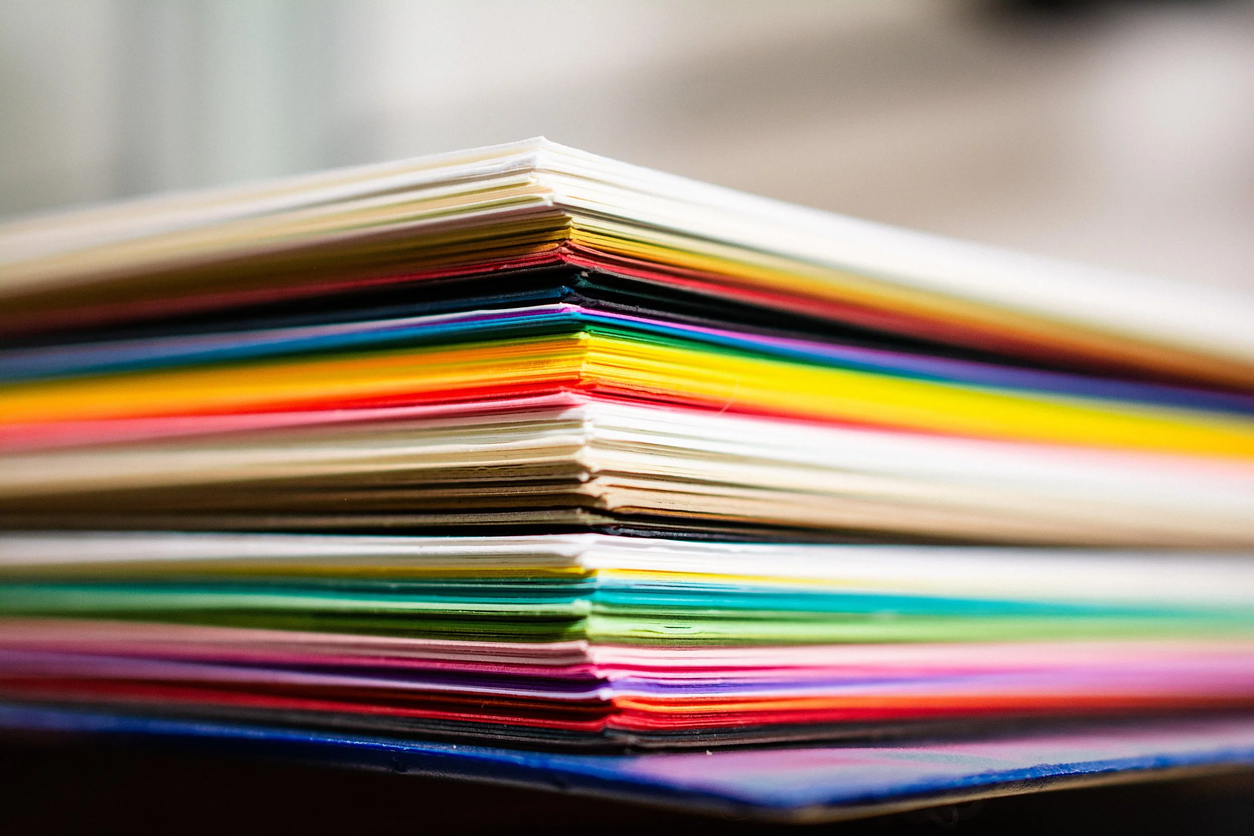
Why we love it: Available in a massive range of colors and weights, Colorplan features a subtle texture that adds character. It’s perfect when you want the paper itself to be a design element, not just a background.
Ready to Print?
Choosing the right paper can feel technical, but you don't have to guess. Whether you need the archival quality of Coventry Rag or the dramatic impact of Sirio Black, our team is here to match your design with the perfect substrate.